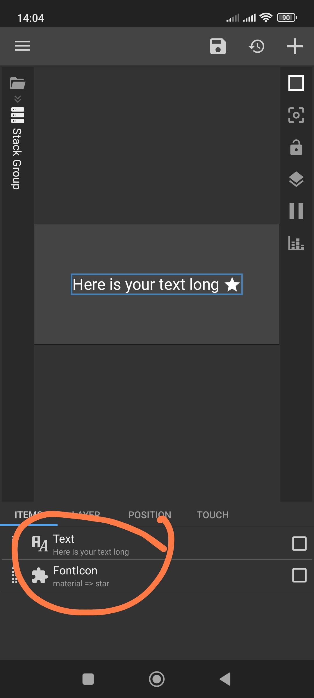
I know this is simple but I can’t get this figured out. I want text centered, to the right of the text I want an icon. The text will always be bigger, and may change size and length. But I always want the icon to be just to the right of the text. But I only want the text to be centered. Hope that makes sense, thanks
Hi there,
Here’s my tips on aligning text & icon.
I hope this would help.
![]()
![]()
PREVIEW
PRESET DOWNLOAD
How to Open in KLWP
- Rename the downloaded preset file (the .zip file): remove the `.zip` suffix from the filename
- Copy/move the renamed preset file to the `wallpapers` folder, under the installation folder of the KLWP
- Run the KLWP editor and load the copied/moved preset
Hi thank you! But sorry I didn’t mention, my question is about a KWGT widget, not KLWP
Oh, great! Thanks! I’m sure this will come in handy
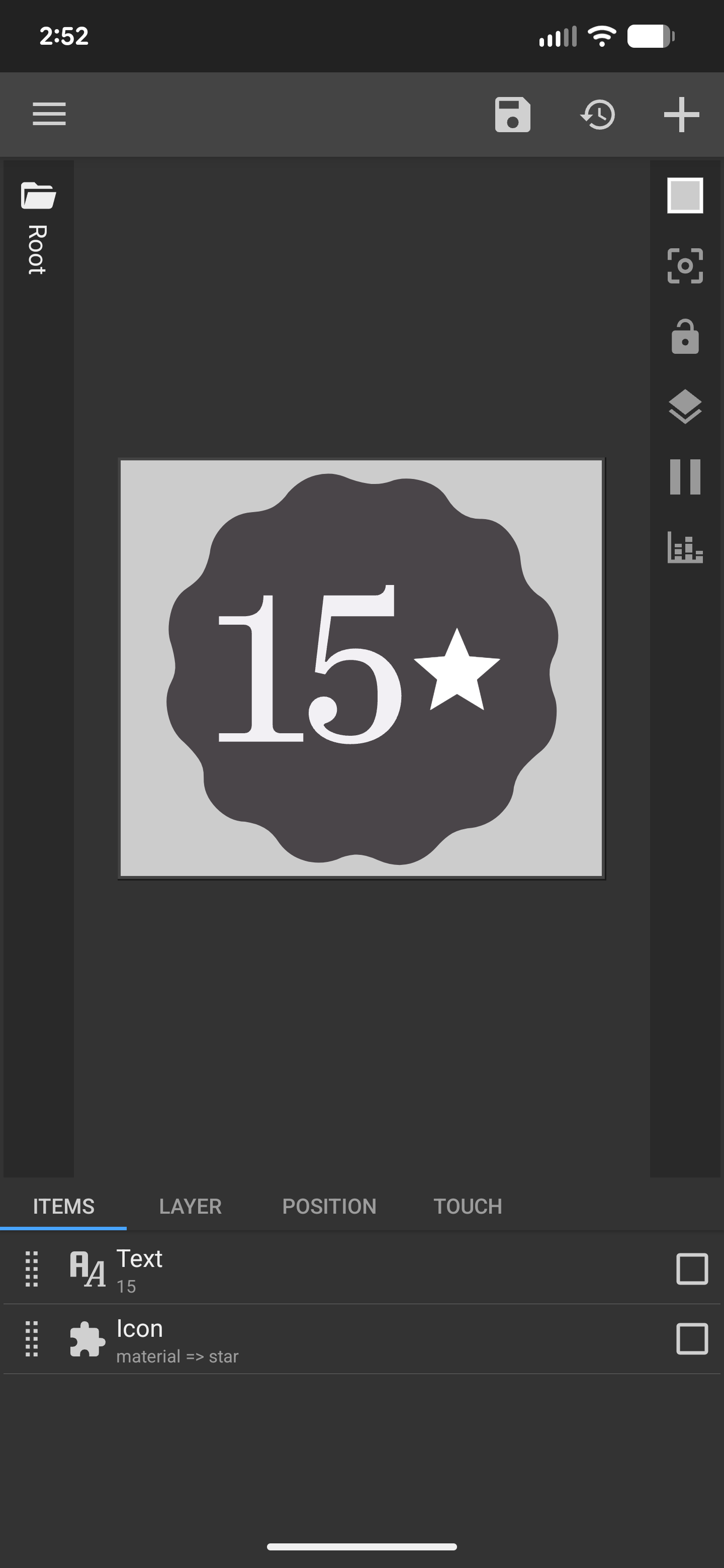
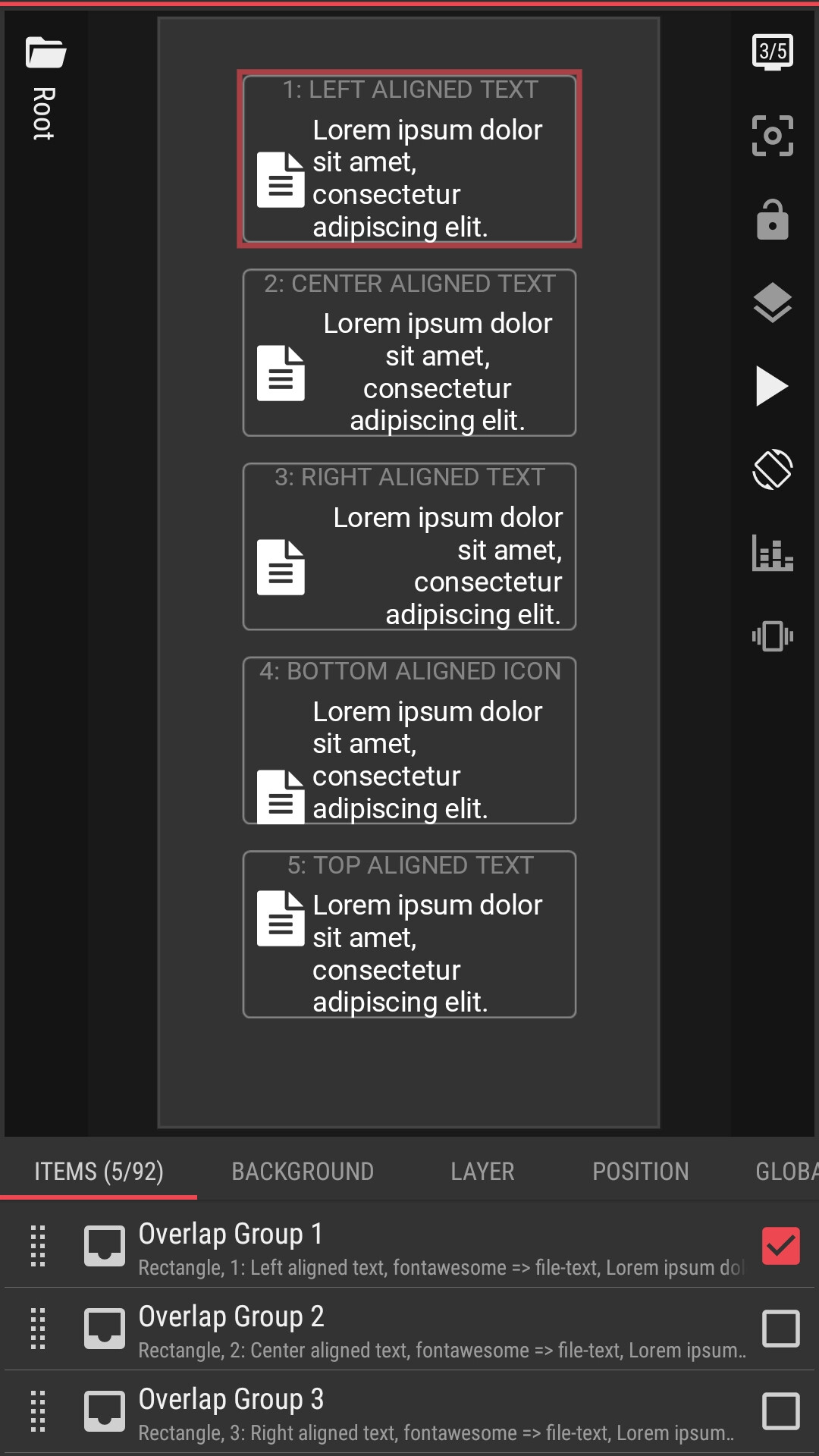
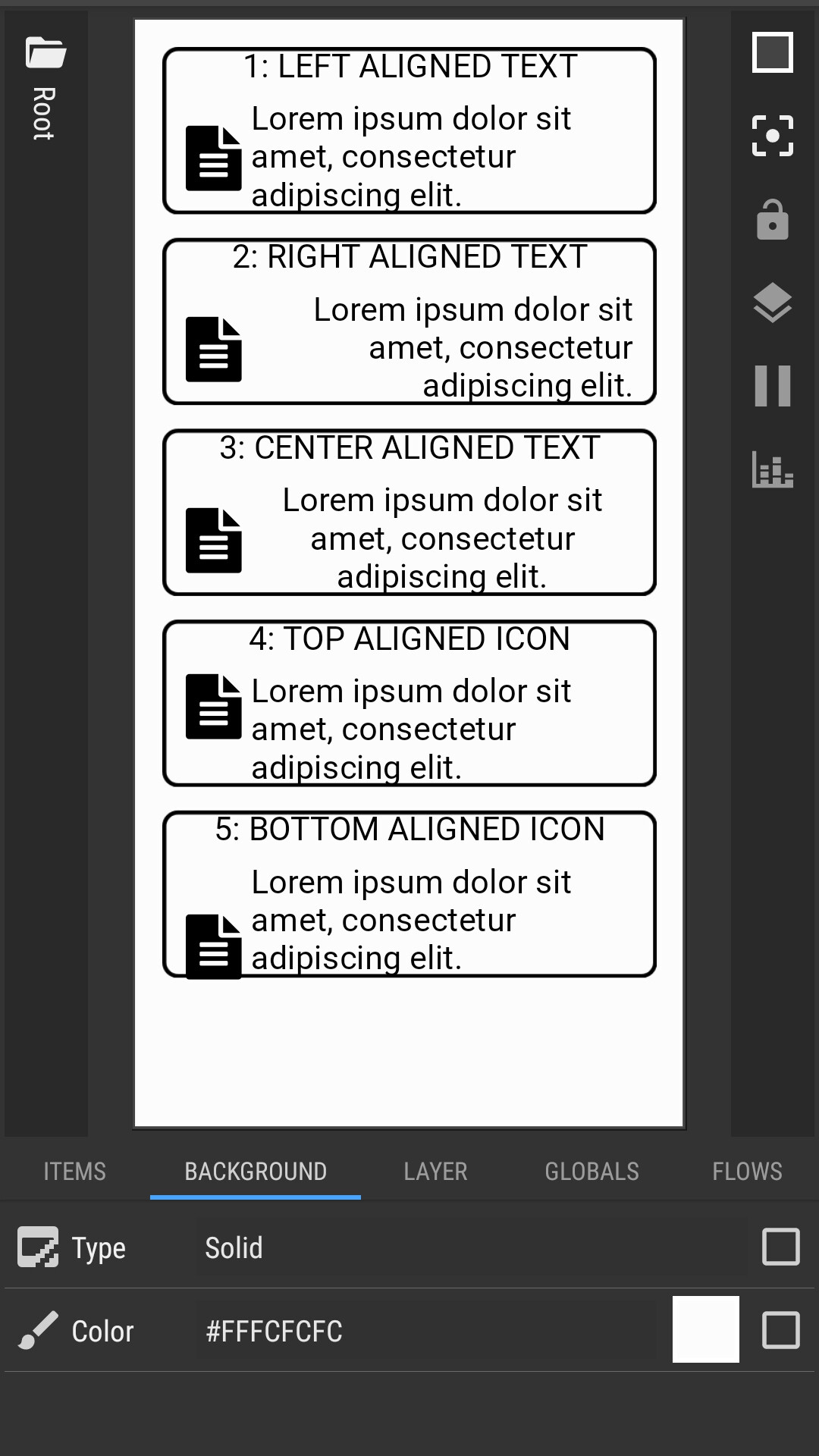
You should’ve shown what you wanted right from the start, because the text can vary in length and different cases require different layout approaches. In this situation, you can create an Overlap Group and place all three elements inside it — the background, the text, and the icon. Set the widest digits for your font, for example ‘00’, and position the icon with a fixed offset on the right side. Just keep in mind that ‘11’ is much narrower than ‘30’, especially with a decorative font like yours. In that setup, the icon will stay fixed on the right, while the text will always remain centered.
Thanks, sorry I wasn’t very clear in the beginning. Your layout worked, but, I was kind of hoping for this icon the pop out to the right very close to the text ( this is for my calendar event idea again from before). So I guess my real question, is there a way for this icon to be “tethered" to the text, as in it will also move right or left with the text, but also be as close as in the picture below (done just for example). The problem with it currently is that if I tether it to the text, it won’t actually place overlapped with the texts border. Is there anyway to do this or is it just going to have to live further from the text. I had sort of figured this out earlier by putting a dummy icon to the left and making it transparent, keeping the text centered, while allowing the icon to move. But again, it wouldn’t overlap and stuck out a bit. Thanks again for any help.
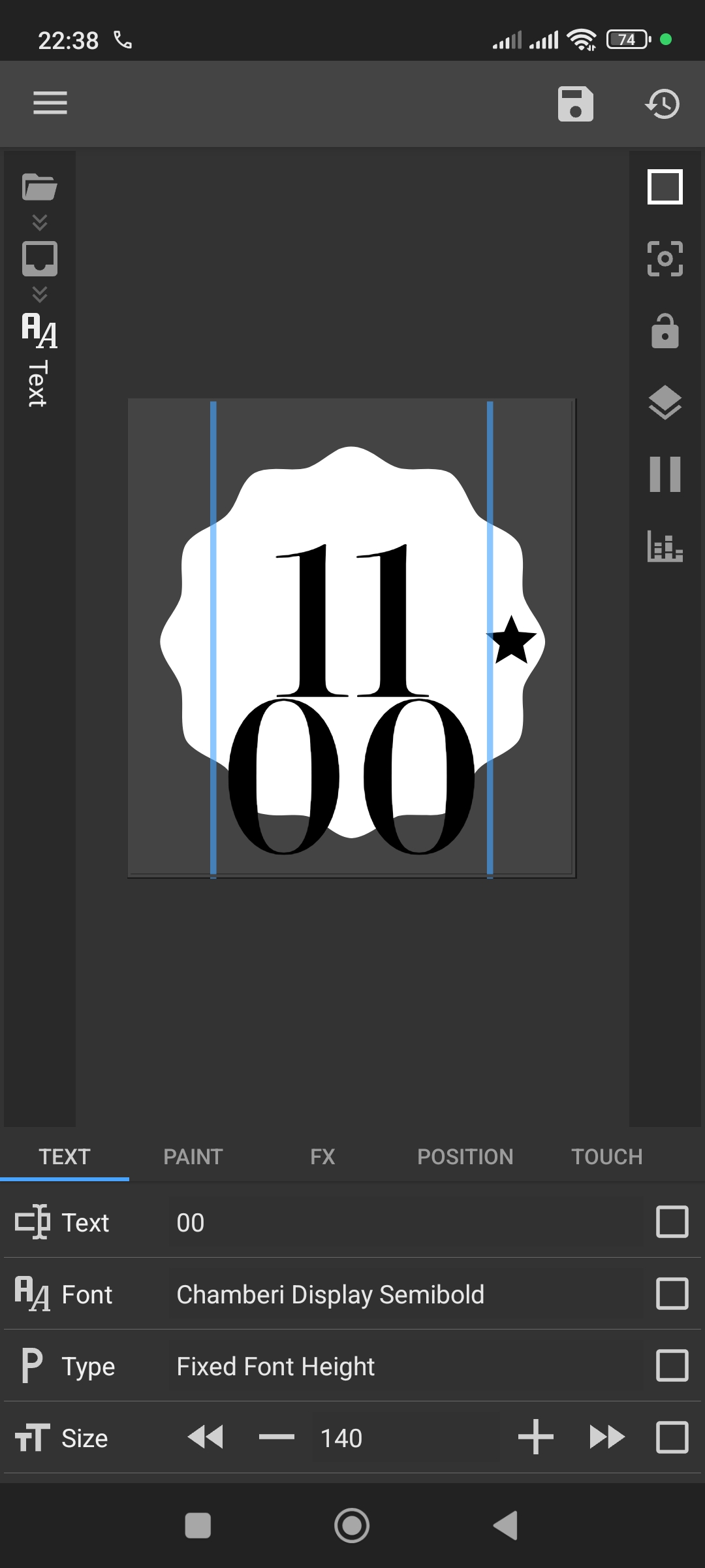
Alright, I understand your idea now, and here’s roughly how you can achieve it.
In this case, my first suggestion actually fits your scenario.
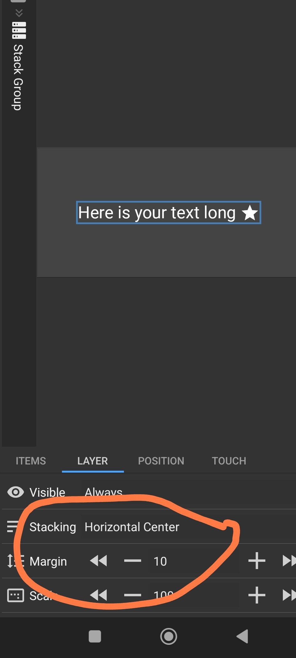
Create an Overlap Group and place your background inside it.
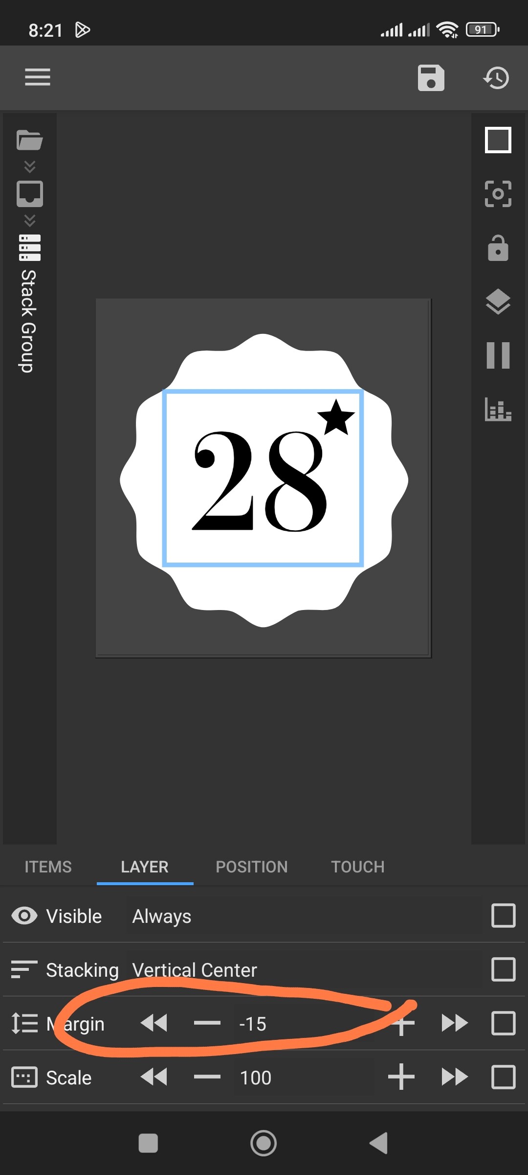
Inside that, create a Stack Group and set it to vertical center alignment.
Use a margin of around -15 (you may adjust it later).
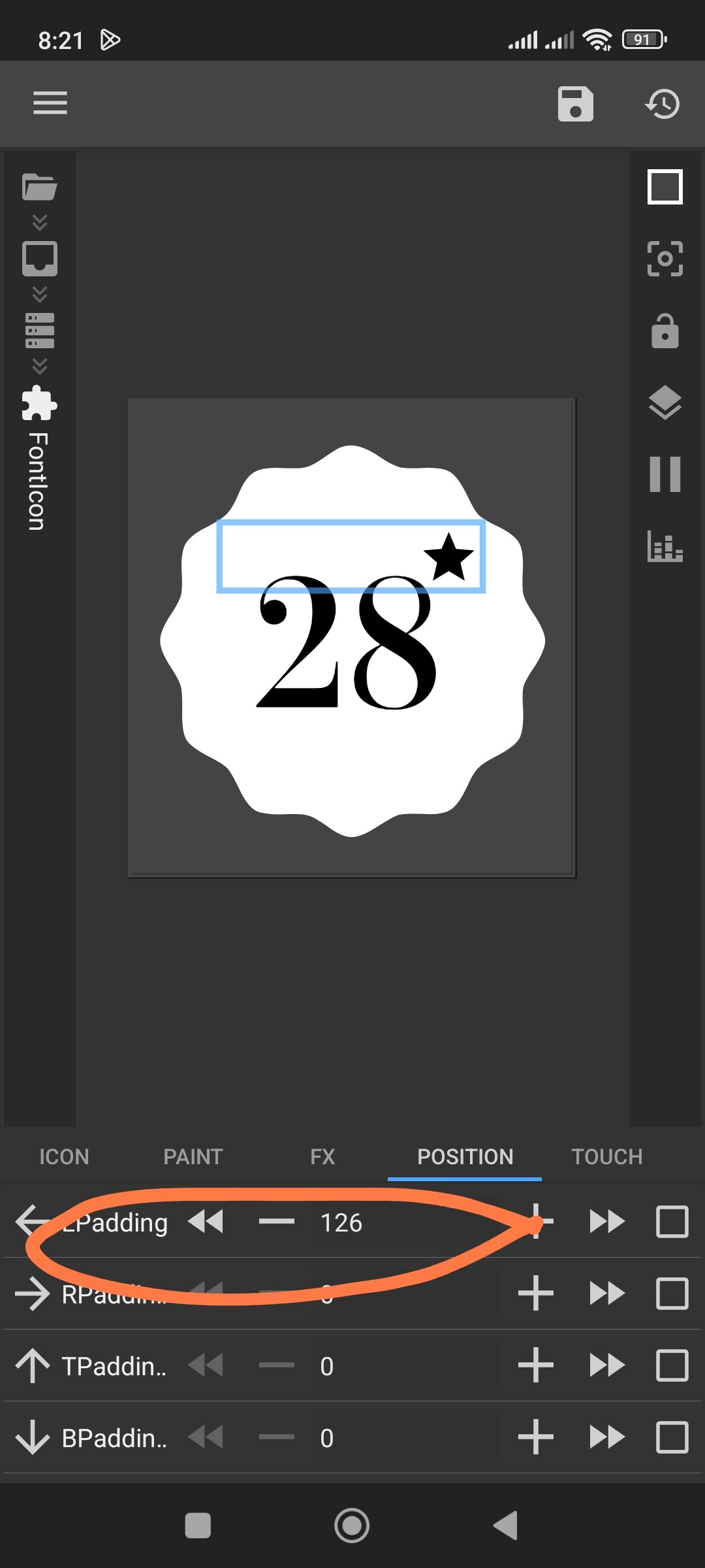
Then create your icon, go to Position, and set L Padding ≈ 125.
After that, create your text and set it to center alignment.
These values are approximate and will depend on your text size and icon size, so you’ll need to fine-tune them a bit.
This way, the text will always stay centered, while the icon will sit slightly above and slightly to the right of it.
Thank you so much, worked perfectly. I tired so many different way, thanks for pointing the way.
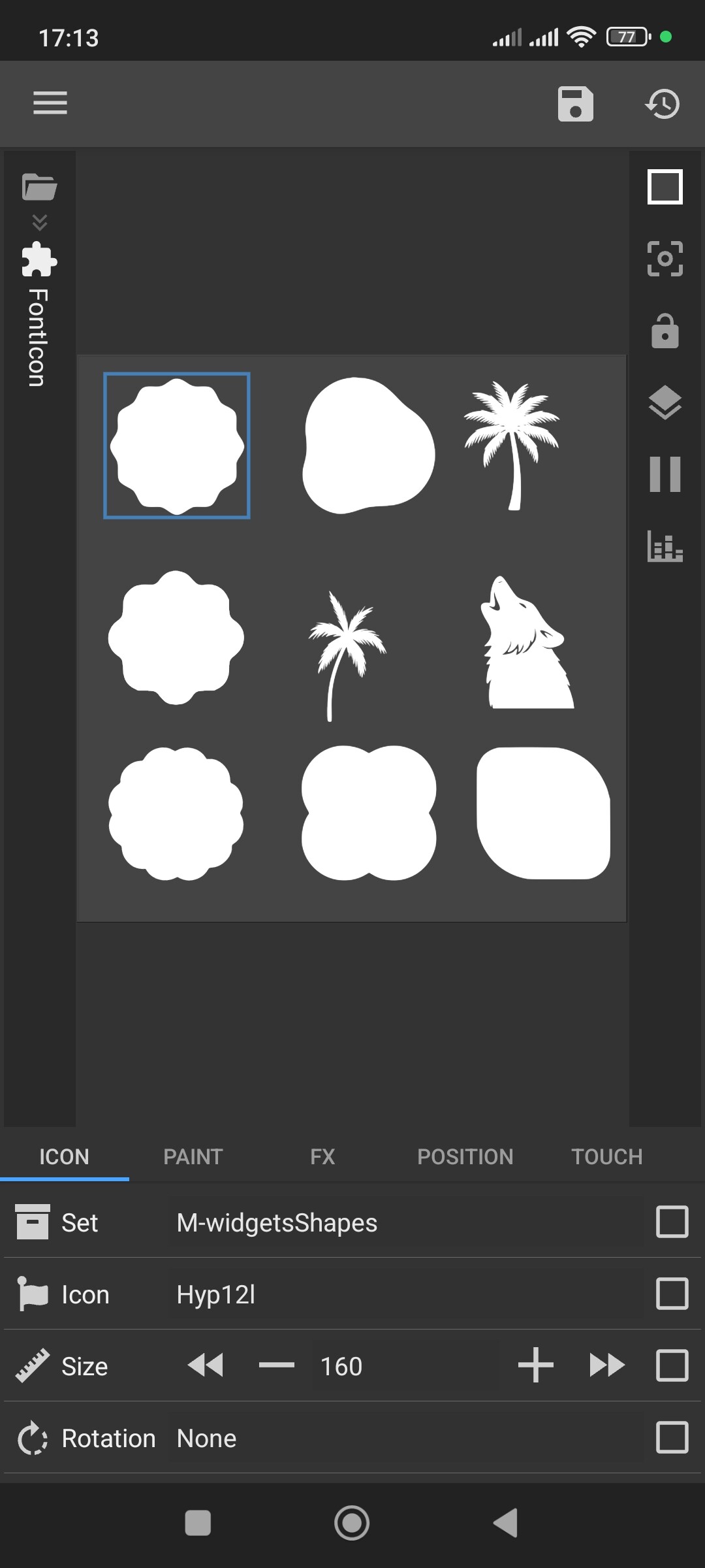
Side note, I am always looking for shapes in fonticon sets, mainly I use a set called Useful Shapes, just wondering if you happen to know of any others, since I saw you used the 12 sided cookie one. Thanks
Very cool. I hope to one day learn how to do that. I’ll give you the ones I was talking about although you probably know of these already since it’s been posted here before, although a while ago
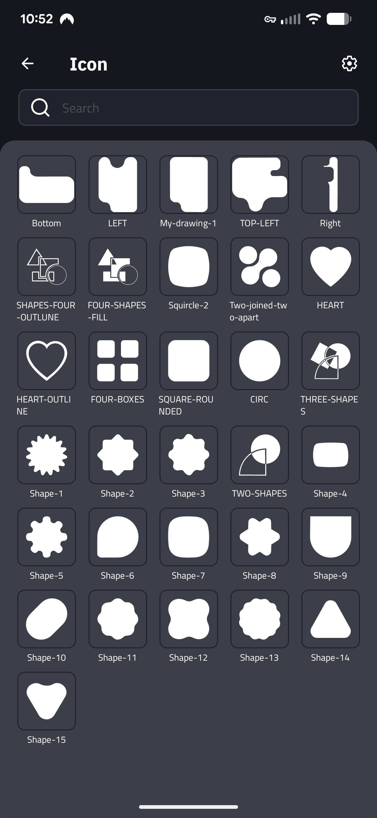
The Useful Shapes is the one I mentioned, but these are all pretty nice: [reddit] WALLSTARS FONTICONS - Google Drive
Thanks for the links! Yes, I know these sets — I used them before as well.
But for my current projects I’m using my own custom icon fonts.
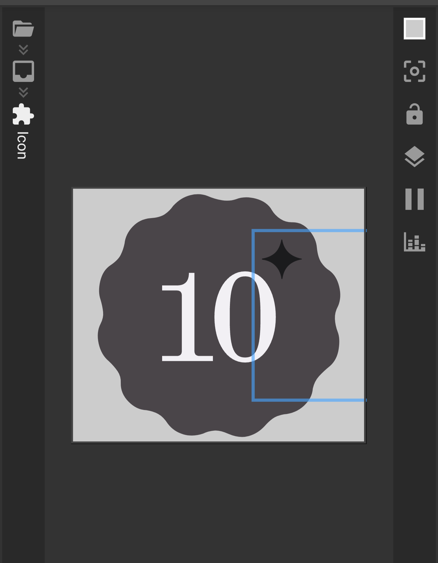
Hey again, follow up question on this, is there a way to “anchor" the icon to the text while still using the margin setting to get it close? Right now it kind of stays where it is, but I don’t like to use padding on my calendar date, so for days 1-9, there is a larger gap between the text and icon. Not a huge deal, just wondering, thanks
Hi. Here’s my approach for this:
Find the perfect X Position for the icon when the date is 1-9 (single digit) and note that number.
Then, find the perfect X Position for the icon when the date is 10 or more (double digits).
Use this formula for the Icon’s X Position:
$if(df(d) < 10, X_for_single_digit, X_for_double_digits)$